The Suite has a new navigation, designed like an app launcher in the style of the big office suites: fast, clean, and free of menus that unfold endlessly. Here is how to find your way around.
The spine and the panel
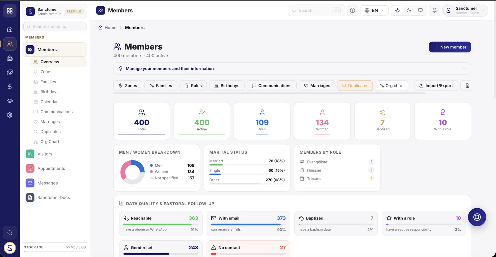
On the left, a slim, permanent column: the spine. It shows your main sections as icons (Members, Services, Content, Commerce, Education, Administration), plus home and search.
- Hover a section icon: a panel slides out and shows that section's applications.
- Click to keep it open. On an application with sub-pages (Finance, Members, School…), the panel lists those sub-pages directly.
Note: the search (the magnifier in the spine, or Ctrl+K / Cmd+K) finds an application, a member or an action in a few letters. It is often the fastest route.
The app launcher
At the very top of the spine, the grid icon opens the launcher. There you find:
- Your favorites: the applications you use most. Click Pin to choose which ones appear - they follow you on all your devices.
- Your spaces: switch from the Suite to Pay or Community in one click.
- Explore all your applications: back to the home page, which lists everything.
The home page: an application dashboard
When you arrive, the home page is an application dashboard: a grid of all your applications, a search box, and filters by category. You launch what you need at a glance.
Pastors and administrators also get an Overview tab with the church's figures (members, finances, attendance…). The Customize view button lets you choose which tab the page opens on by default.
Note: each person only sees the applications they are allowed to. A worship leader won't have the same tiles as a treasurer - that's normal and intended.
Keeping your bearings
- At the top of every page, a colored badge and the application name always tell you where you are, followed by the breadcrumb.
- The grid button stays available everywhere: you can jump to another application without leaving your current page.
On a phone
On mobile, the spine gives way to a bar at the bottom of the screen with your main shortcuts (Home, your sections, and a Menu button that opens the full navigation). Everything stays within thumb's reach.
The search bar
At the top of every page, the central search bar (or Ctrl+K / Cmd+K) searches everywhere at once, without leaving your page:
- Applications - any module, by name.
- Members - by name (if you are allowed to view members).
- Songs - in your worship repertoire.
- Documents - letters and certificates (if you are allowed to view them).
Everyone searches only within what they are allowed to: the search never reveals content you are not meant to see.
As soon as you open it, before you even type, the bar already offers your shortcuts: Recently viewed (the latest records, documents or replays you opened) and your Favorites.
The treasurer's Finance block
The treasurer (and the finance manager) additionally sees a Finance block reserved for them: direct access to Tithes, Reports, Contributions and Cash, with a month overview (tithes, offerings, income). These shortcuts and figures appear only for the treasurer - never for an administrator or a pastor, who don't need them when opening their search. The amounts are church totals, never a single donor's detail.
The Recent tab
On the home page, next to your applications, the Recent tab keeps track of your work so you can return in one click:
- Recently viewed - the content you opened: a member's record, a document, a service, a department, a student, a sermon… with when you saw it.
- Modules - the applications you opened most recently.
This history is specific to you and this device: on a shared workstation (welcome desk, control room), it never follows the next account. It fills up as you go - so at the very start it is empty.
In the application grid, your Pinned apps (favorites) are now shown separately, above All apps.